
July 8th sees (or saw, depending on when you’re reading this) the publication of ‘Agent Llama’ – an action packed, fun-filled, picture book featuring a sleek super spy, who just happens to be a llama, written by ace author Angela Woolfe. It has been my first collaboration with Angela as an illustrator, and I was immediately taken by the story’s spy film influences and the daft array of villains who pit themselves against the hirsute heroine – Charlie Palmer.
I created the artwork for this book throughout the summer of 2020 – the year that got cancelled – sitting alone in a studio that I once shared with the employees of an animation company. The studio had gone from being a vibrant and buoyant workplace to a hollow sepulchre in the space of a few weeks, as people evacuated to the solace of their homes to continue their work.
Having an entire studio to myself had its bonuses, but it nevertheless felt weird… and times were only going to get weirder. So I was hugely grateful to have such a fun project to keep me from slowly losing my sanity, like a marooned sailor surrounded by a sea of empty Ikea desks. In fact, I attribute creating the artwork for ‘Agent Llama’ as one of the main factors that got me through the majority of lockdown. I was like a boy in a toyshop – and it was time to play.
When creating the visual world for Charlie Palmer I knew I’d have the chance to visit a host of cultural references from the world of film and TV. And when taking a deep dive into the spy cinema aesthetic, there is only one place to start… Bond… James Bond.
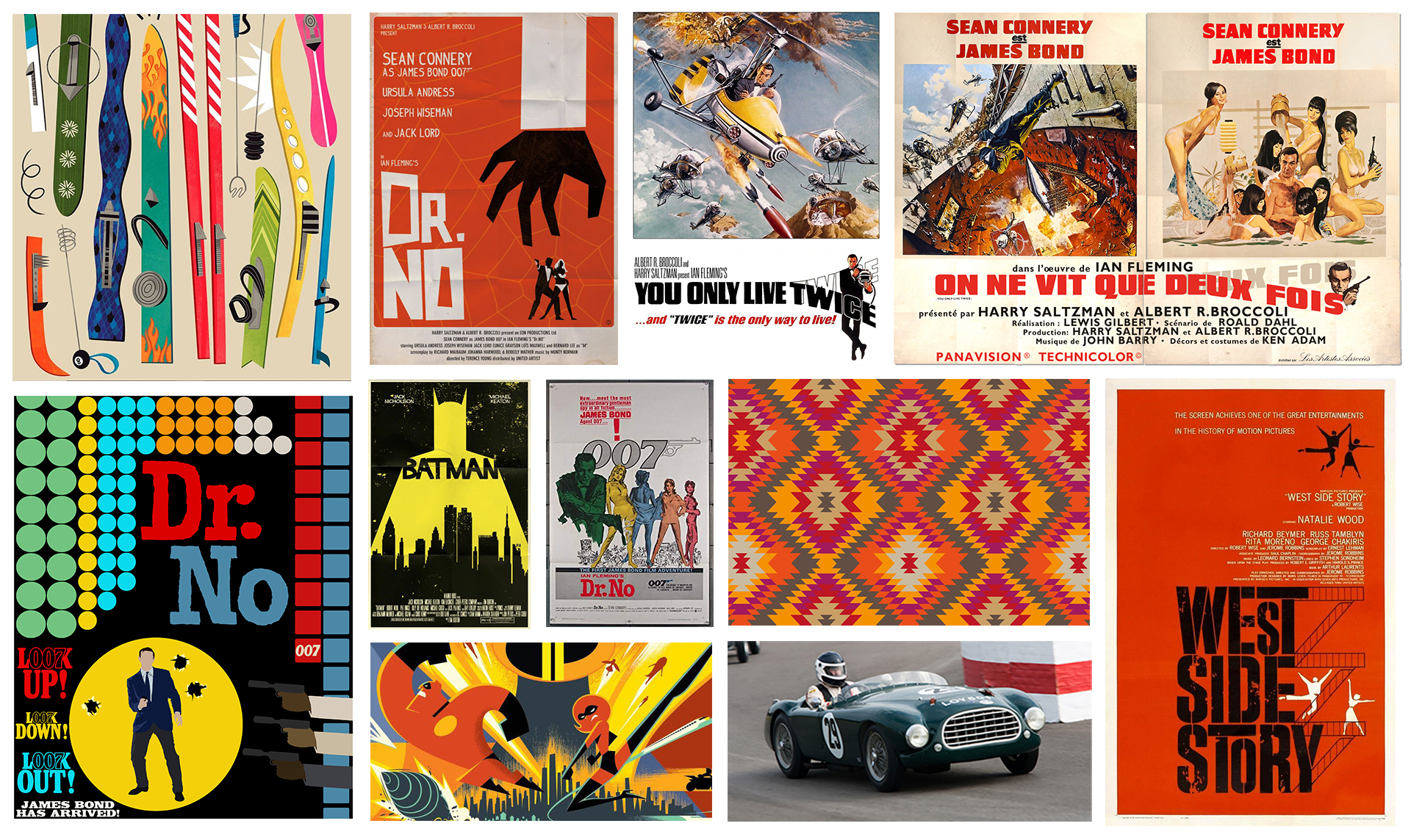
Initial Agent Llama moodboard
Whilst I am too young to have experienced Connery era Bond first hand, I do remember the posters and video jacket designs that filtered into my cosciousness when perusing movies at my local video rental store – so, evidently I’m not that young. The ones that really struck me were the Frank McCarthy classics: ‘You Only Live Twice’, ‘Thunderball’, and the often overlooked ‘On Her Majesty’s Secret Service’. What I loved so much about these posters is that they gleefully shunned the idea that less is more. In fact, each design seems to encapsulate the entirety of each film in a single image – albeit it, a very busy one. I like to imagine that the meeting between McCarthy and the film’s producers went something like this:
Frank McCarthy: “So, which of the film’s numerous action set-pieces would you like me to focus on for the main poster?”
Cubby Broccoli: “Yes.”
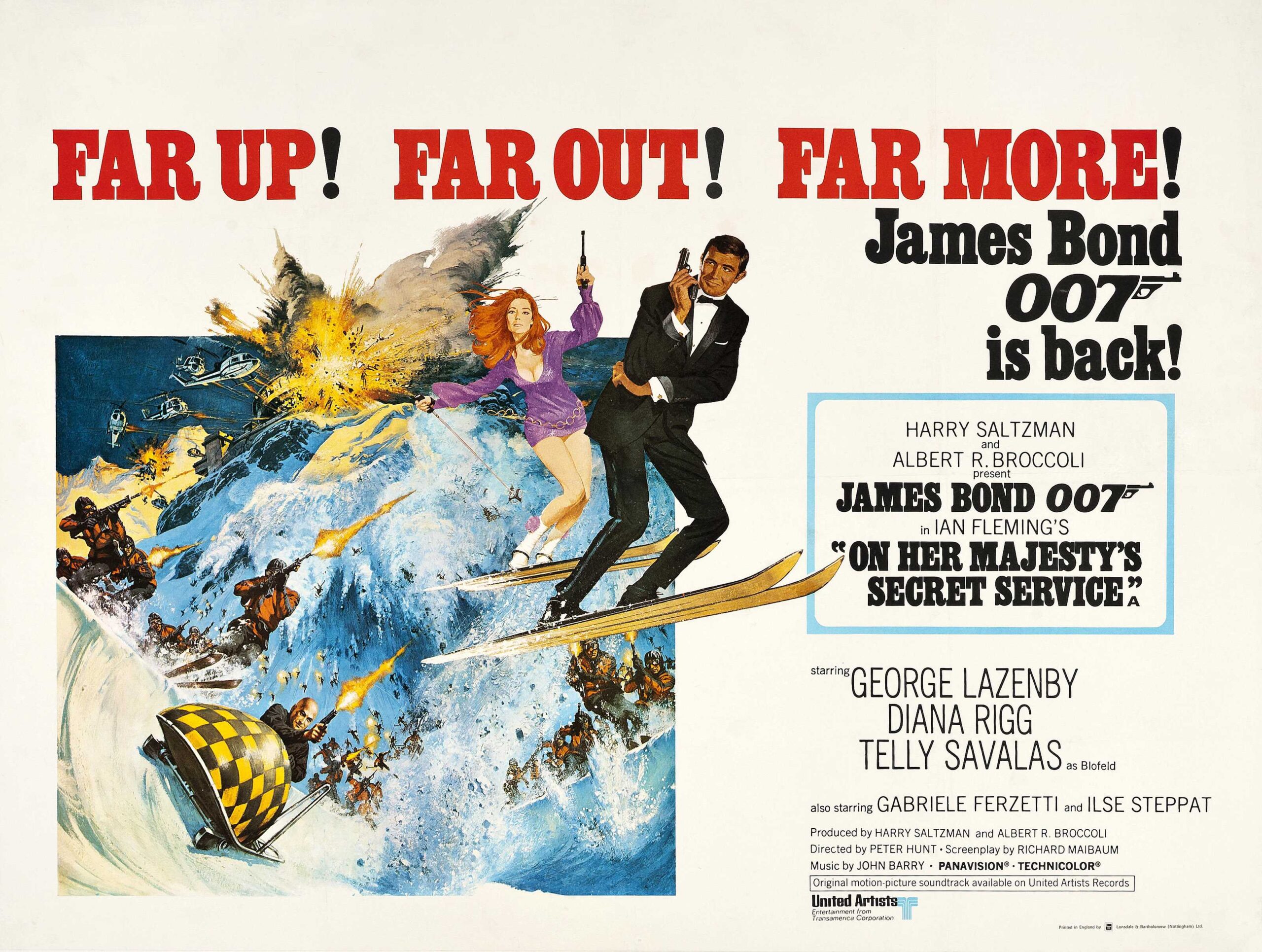
Frank McCarthy’s poster for ‘On Her Majesty’s Secret Service’ (1969)
And there we have it. ‘OHMSS’ is probably my favourite case in point here. Just look at it! We have George Lazenby and Diana Rigg fleeing Telly Savalas and his goons whilst flying through the air on skis. A tuxedo-clad Lazenby adopts a casual stance with one arm folded across his chest, whilst Diana sports nightclub wear and does a sort of go-go dance – pistol in one hand, ski pole in the other. Meanwhile, Telly careens down a mountain in a bobsleigh, popping caps into the air, alongside an army of ski-ing henchmen. And we haven’t even got onto the exploding helicopters!
It’s a ludicrous scene of slapstick revelry, and this image, more than any other, underpinned my entire approach to the artwork in ‘Agent Llama’, as you will no doubt note from some of the similarities within the pages.

An early Frank McCarthy-influenced cover design for ‘Agent Llama’
As for Charlie Palmer herself, I had to take a slightly different approach. Whilst it was a lot of fun to visit 60s and 70s era Bond to help build the visual world for the book, in terms of character he’s now deemed a little erm… dated. Charlie is a no nonsense, feisty, self assured female spy… and she’s a llama. So, naturally, I based her on Tilda Swinton – who, I might add, would make a formidable 007 should MGM ever decide to reinvent MI6’s finest as a female. Anyhow, it was her slender neck, devastatingly cool wardrobe, and wondrous hairstyles that won me over.
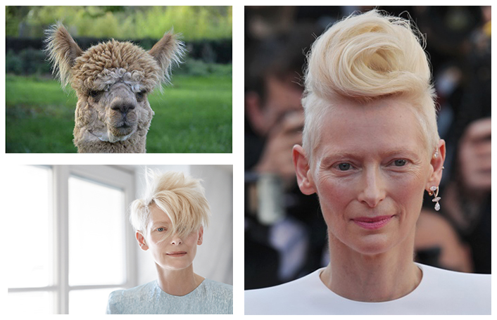
The irrepressibly cool (and llama-like) Tilda Swinton
For me, ‘world building’ (as they probably call it in the boardroom of some hip design agency) is one of the most gratifying parts of book illustration. For ‘Agent Llama’ I thoroughly enjoyed rummaging through the cultural reference points of my childhood and redressing them for the contemporary reader. I had a lot of fun adding the pictures to Angela’s verse – maybe too much. But in a year that featured numerous lockdowns, isolation, and bookshop and library closures, that’s no bad thing.
